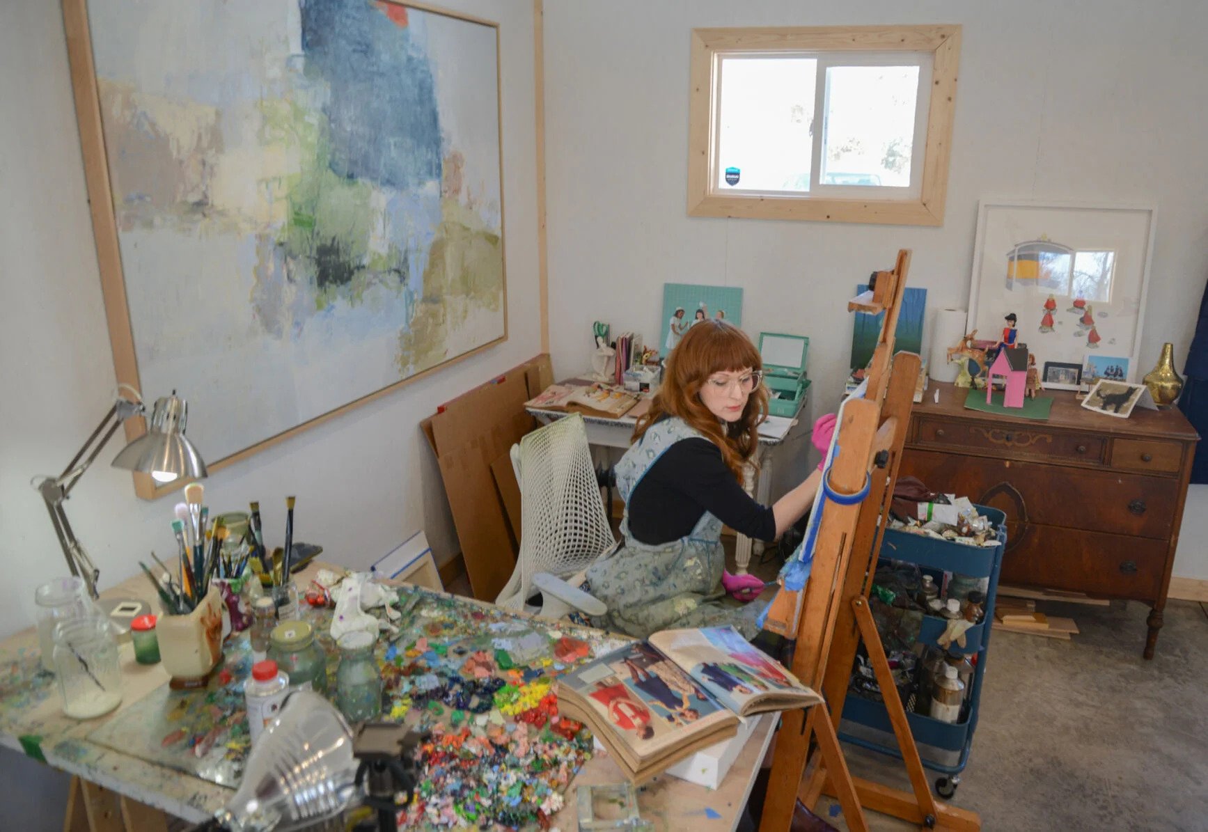
Shades of girlhood: Zoe Hawk
VOX DIGITAL PRODUCING
Viewing a Zoe Hawk painting feels like stepping into a storybook itself. So what narratives lie behind Hawk’s fantastical works?
Jack Calvert/Missourian

During my March 4 shift for Vox, I worked on a story about a painter based in Columbia. I proofread the article, created headlines and subtitles, and formatted everything for the web on BLOX. I also added keywords and embedded a number of different photos and different formats. Figuring out the best way to display the paintings did require some trial and error.
It was a pretty simple shift in terms of digitally producing, but the details of visuals and how best to go about them in terms of presenting to an audience become clearer and clearer after every shift. Overall, since this was a story about visuals, I loved how we could showcase that in the best way possible.
Find the story here.
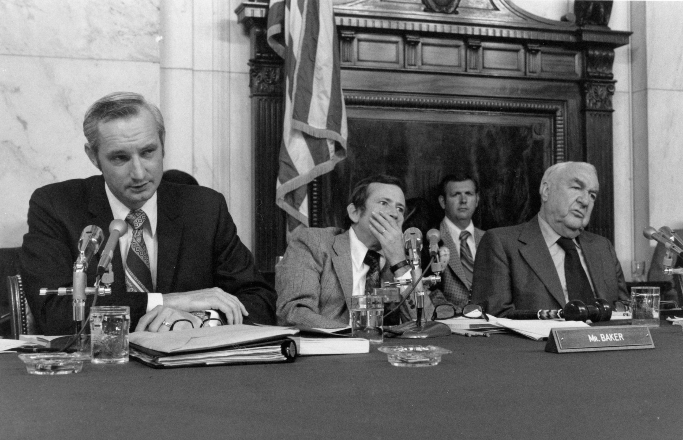
Donald Sanders: Playing a pivotal role in the Watergate investigation
VOX DIGITAL PRODUCING
Sanders’ FBI work and the Watergate investigation shaped his career, but the Missouri native’s legacy had its own lasting impact on national politics.
Courtesy of University Archives/University of Missouri Collection C:22/9/1
As a part of my April 30 shift, I helped digitally produce one of the Columbia history features. Specifically, the one covering Donald Sanders and his impact statewide and nationally.
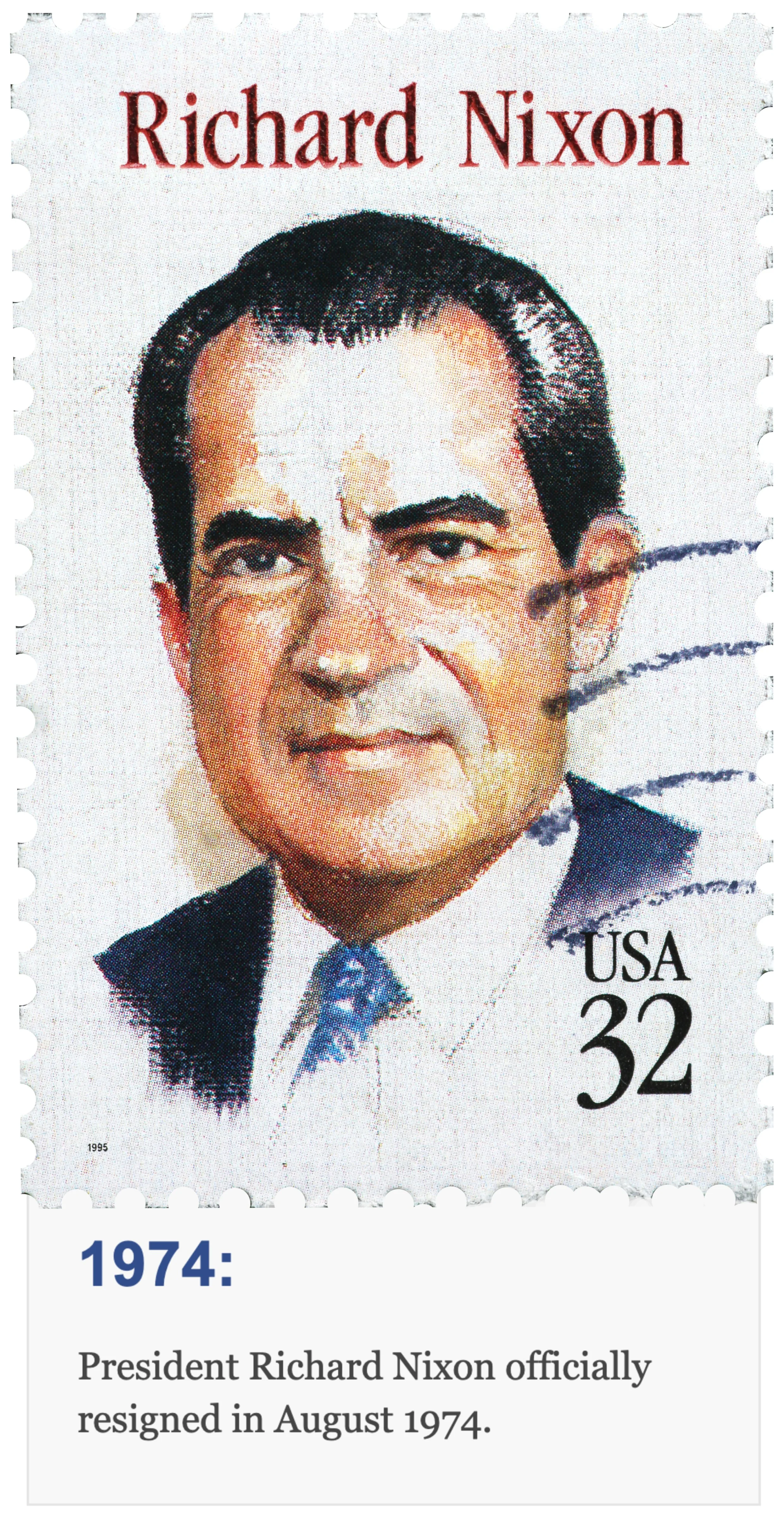
Some of the graphics came pre-made, since it was a series of features, and there was a certain theme that each of the stories had. I also decided to continue to add to those visuals by taking historical photos and creating different kinds of designs to keep the piece comprehensive and make sure the reader was able to stay engaged visually.
That included going into Photoshop to separate and digitize the writing in the photos and then finding unique ways to continue building on the original graphics.
This story also had a unique coding aspect added, and I had to go into the HTML to turn some of the text blue. I’m confident with website development, but I hadn’t had the chance to utilize it much this semester outside of embedding, so I was really excited to add this.
It took some extra work, but I'm overall very happy with how the layout turned out.
Find the story here.


Left, the House Committee on Internal Security and its staff pose in 1973 for an official photograph in Room 311 of the Cannon House Office Building in Washington. Chief Counsel Don Sanders sits second from the right at the table next to the Committee's three other counsel.
Right, Don Sanders and his former FBI boss Clarence Kelley photographed in 1973, just a few weeks after Sanders had questioned Alexander Butterfield about the existence of a taping system in the White House.
University Archives/University of Missouri Collection C:22/9/1


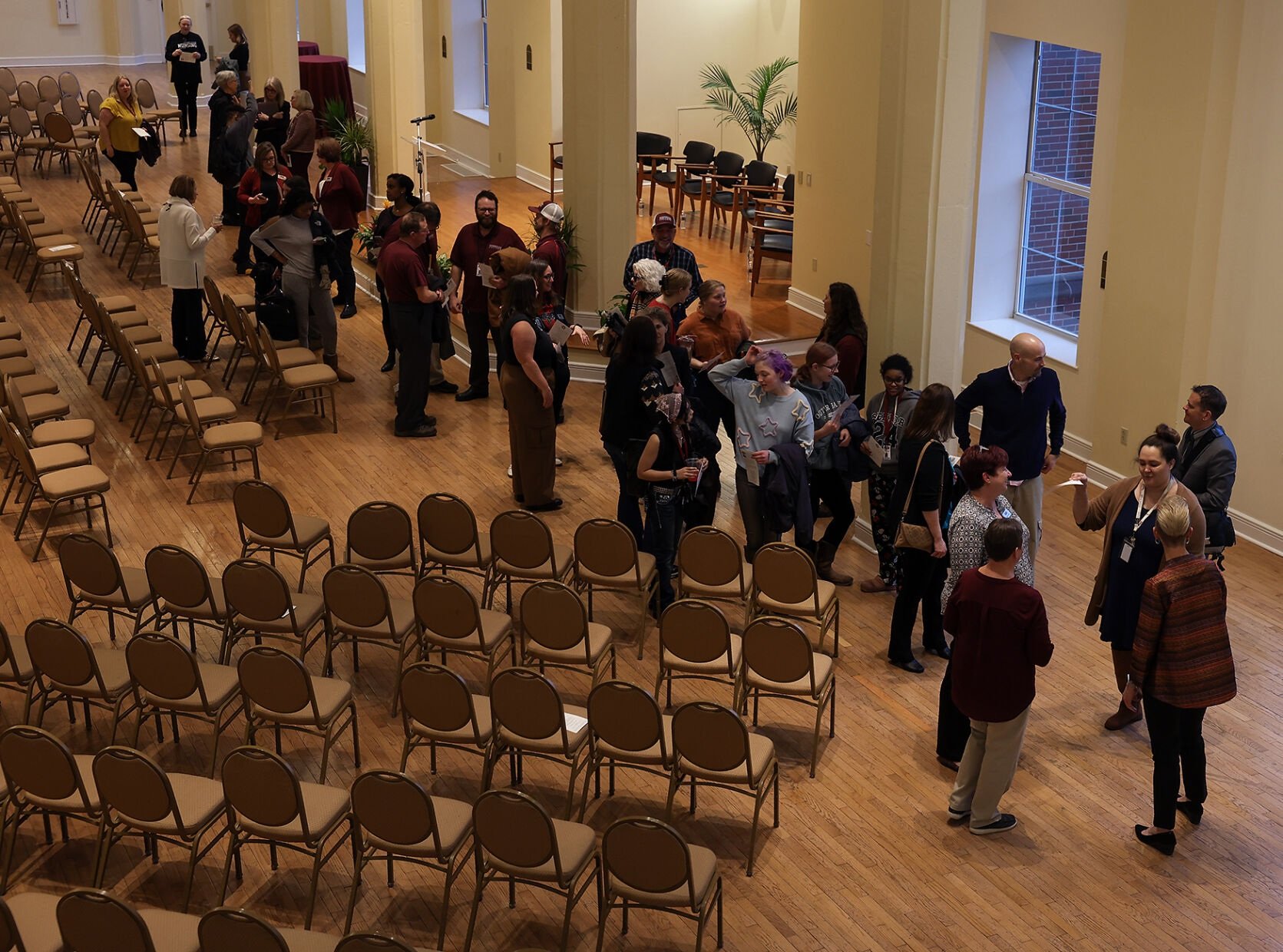
Incoming Stephens College president makes on-campus debut
MISSOURIAN EDITING
Shannon Lundeen, Stephens College’s next president, was welcomed by faculty, students and staff at her Tuesday campus visit. Lundeen will begin her tenure June 1.
Nam Nguyen/Missourian
During my March 4 shift for the Missourian, I spent part of my shift looking over and making edits for a story about the incoming Stephen’s College president. In my editing, I looked at the grammar, style and structure of the piece. Some changes were overall AP style things while some were local Missourian guidelines.
One thing I caught and had to refer back to the stylebook was referring to Stephen’s College solely as a college or school on second reference instead of a university like the reporter originally wrote. You can find that stylebook entry here. More details on what edits and updates were made is visible in the Diffchecker PDF. The pink represents the original piece, and the green represents the edits made.
Find the full story here.

Enhancing the story: Vox interactive graphics
VOX DIGITAL PRODUCING
A mix from a guide for the documentaries you want to see this True/False season, to where to find romance-only bookstores throughout the Midwest.
Yi Gao/Missourian
READ MORE BELOW
Each film corresponds to where they thought it fit best on the scatter diagram.
I also created two different interactive maps for stories through Datawrapper.
The first was an add-on to a piece about where to find spring drinks in Columbia, and felt like the best way to showcase a list of locations. The second, created for a story about romance novels, was a suggestion from the writer who found multiple romance novels in the Midwest.
These sorts of interactive graphics are a unique way to help bring complex information to life and grab people's attention. I think they help turn raw data into something easy to understand, highlighting patterns and trends that might get missed in just plain text.
Spring drinks can be found here. Romance novels found here.

During my Feb. 12 shift for Vox, I created a “True/False Matrix” based off of an image and details a reporter gave me. I had to fact-check the reporter’s work, build a template and background and individually add each point to a map using Genially.
It was time-consuming, but overall I really like how it turned out. The piece is interactive and was originally embedded on the Vox website.
Overall, the big picture is that stories and headlines should be true to what’s presented and also be compelling enough to get readers engaged. In the same way, I think the fact-checking work is just as important as making the matrix look as interesting and engaging as you can to the audience.
Find the Matrix to the right and the full story here.

A paper copy of the original matrix that the reporters had imagined.
Headline writing
MISSOURIAN EDITING
READ MORE BELOW
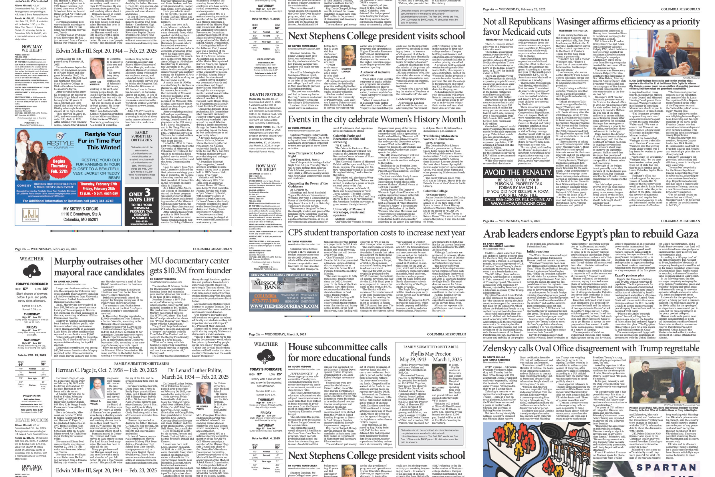
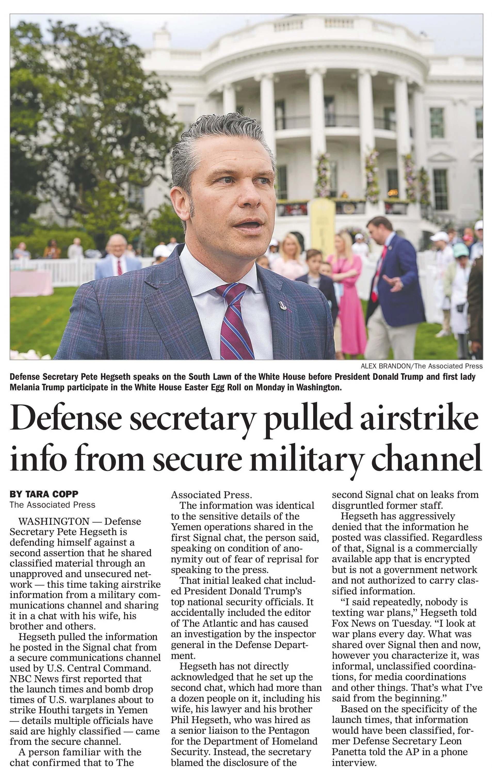
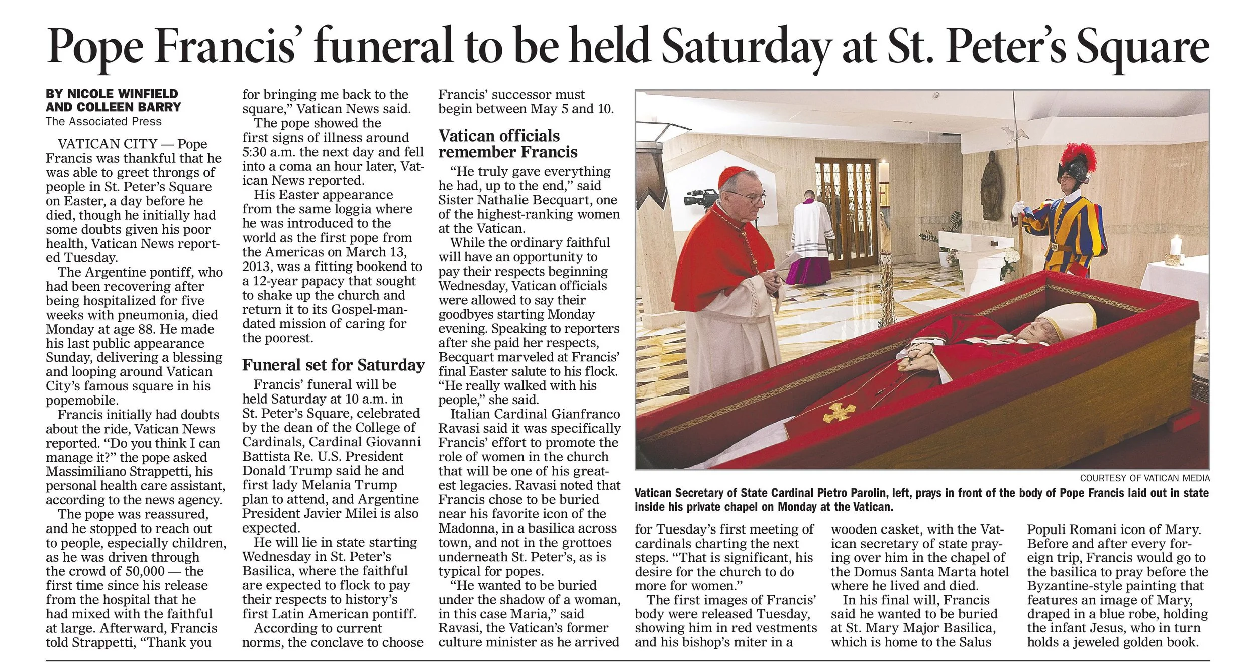
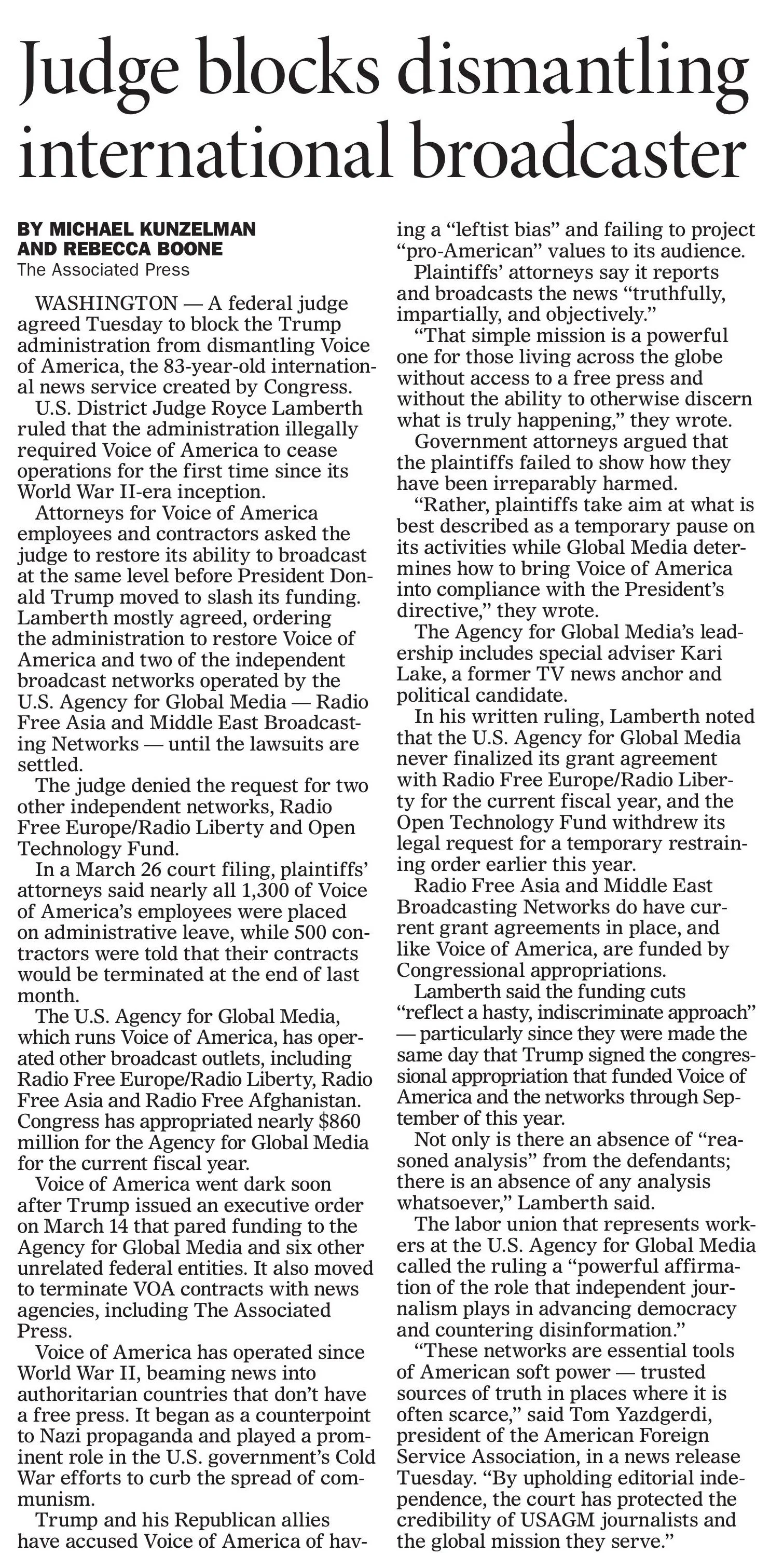
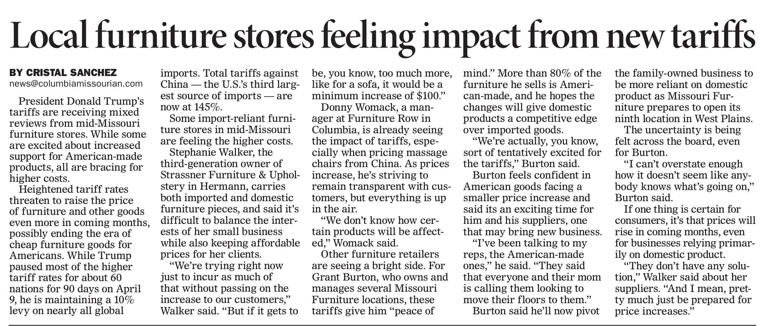
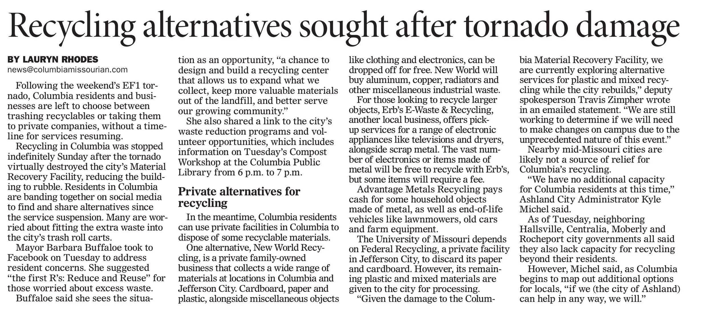
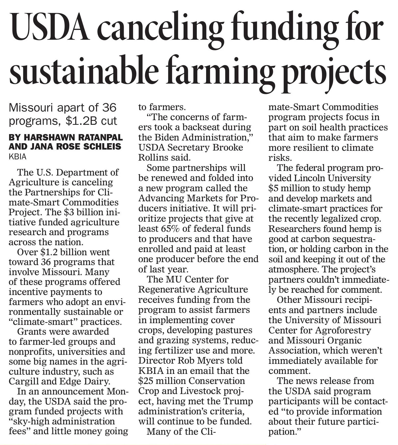
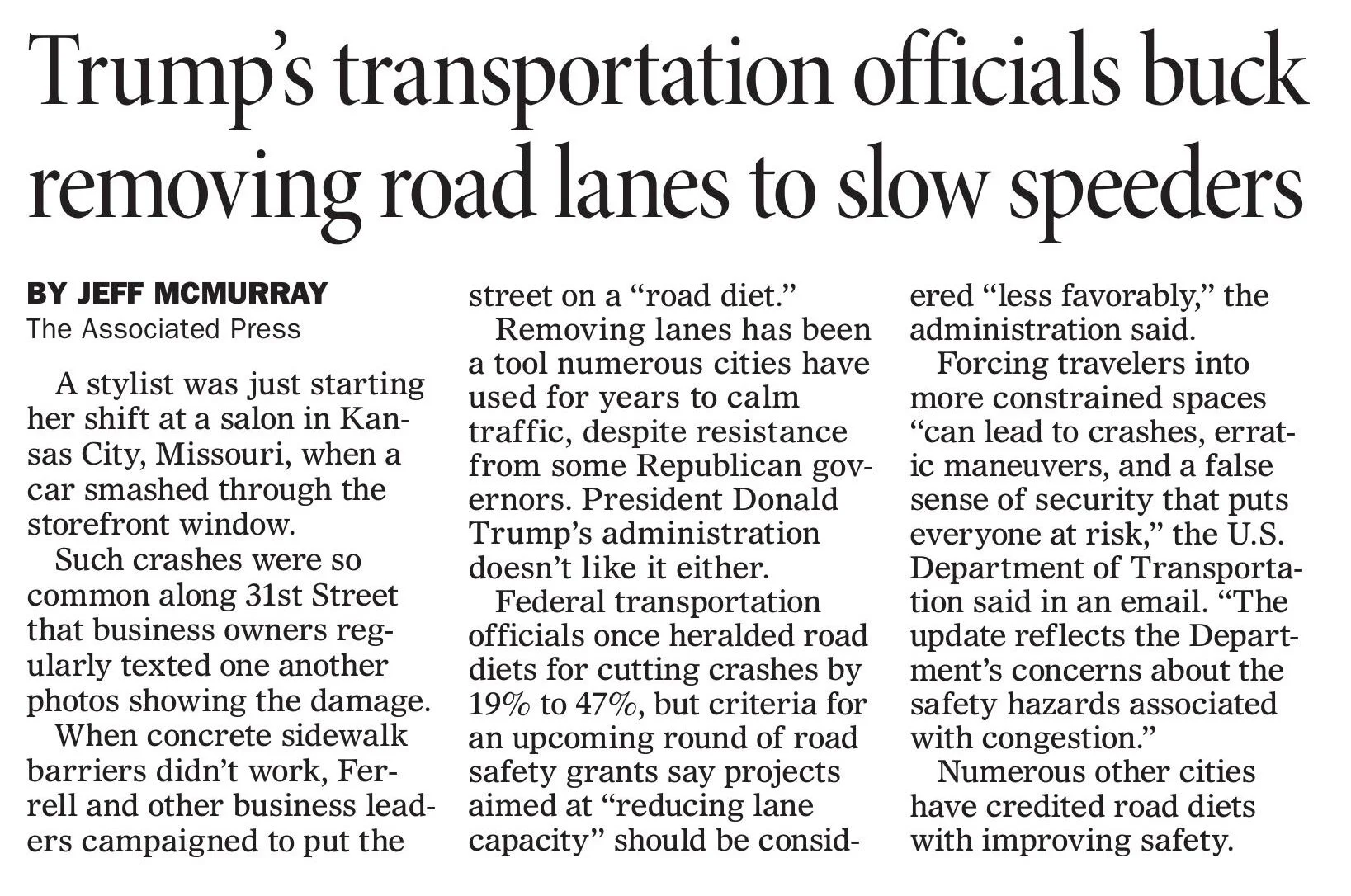
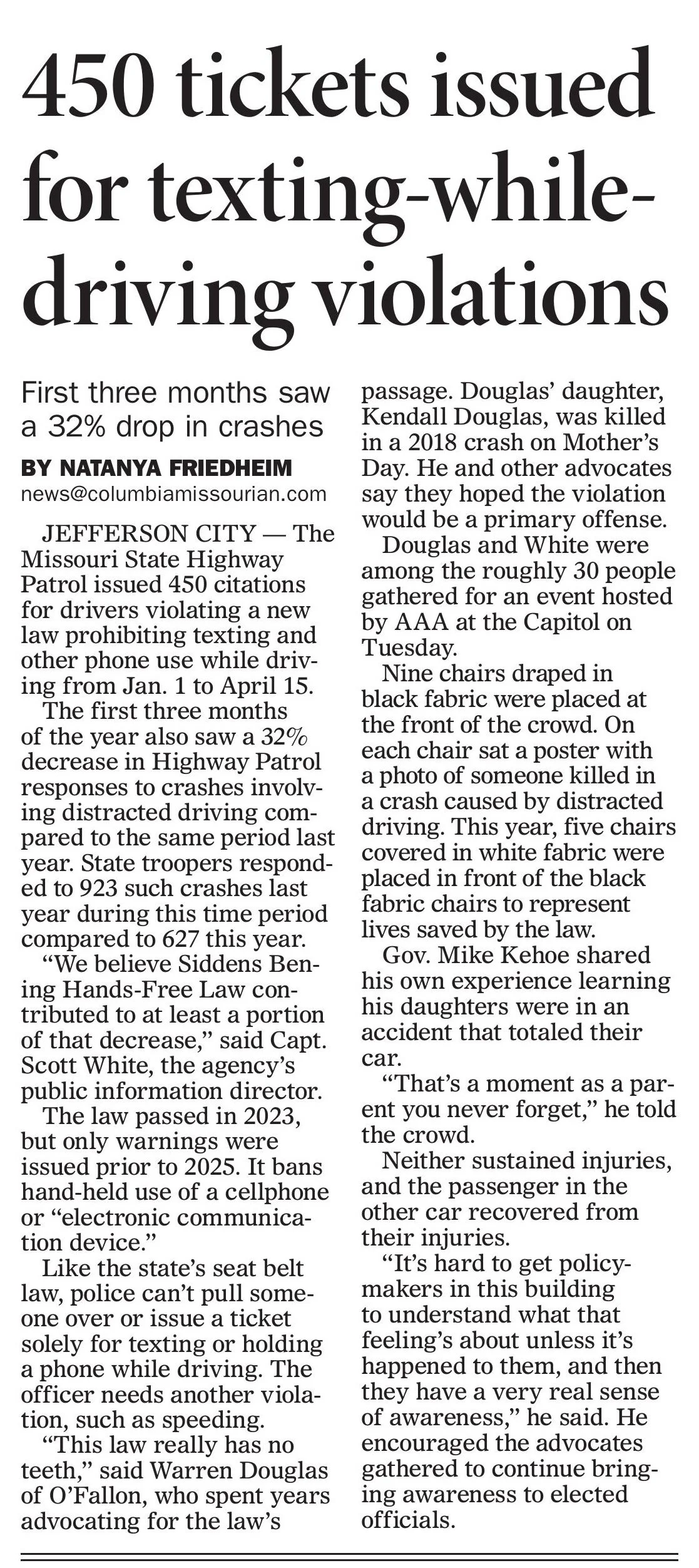
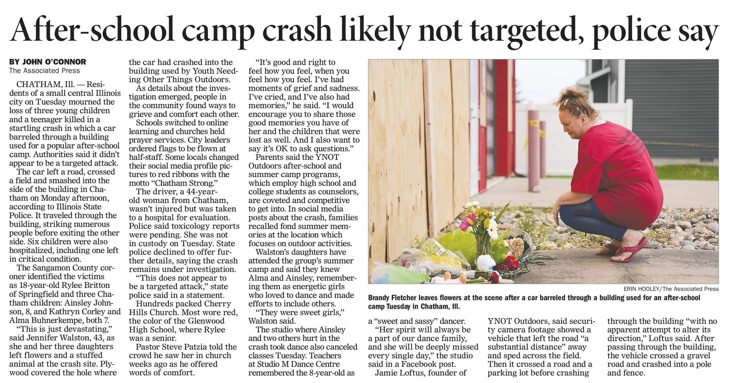
My time at the Missourian has slowly merged into posting a few AP stories at the start of the shift, then turning to the digital side of production in terms of page design. A lot of my shifts now just center around cutting stories for print and headline writing on pages.


Specifically, I kept the NPR headline list in mind when choosing phrasing. Keeping it simple, making it easy to understand, and being specific really helped me to hone in on the main ideas of the stories. I think that overall, it helped with word choice and options.
The one direction I was given during midterms was to minimize any extra white space on headlines, and that was specifically what I focused on during the second half of the semester. Below are examples from the print version of the Missourian in March, April and May.







This portfolio was created for Cross Platform Editing and Producing 2.
It’s been an honor, thank you. 🫡🫡🫡

